Toolkit for Schools Working with Pregnant and Parenting Teens - Kate Thomson
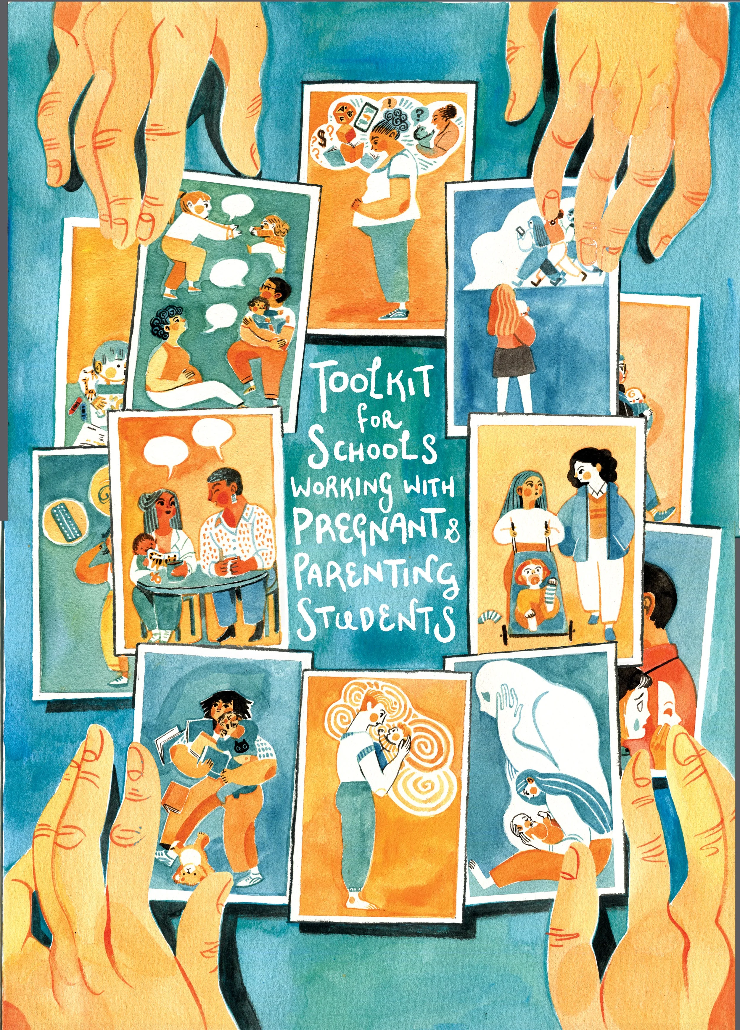
Cover. Watercolour on paper with digital text
I was invited this summer by Kate Thomson to give a visual identity to her brilliant Toolkit. Together we designed a project overview that is both a digital resource and ready for print in the future.
All the colour motifs and illustrations are watercolours and ink. I think this gives the document textures and warmth that aren’t always present in digital work.
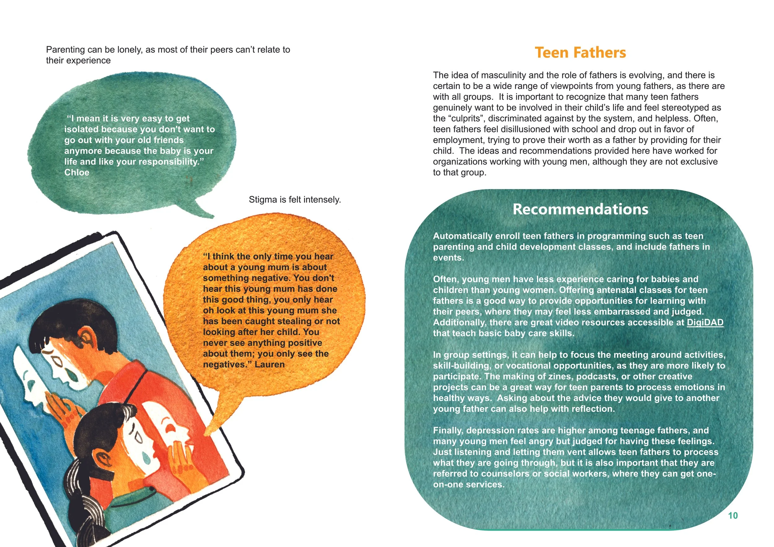
We were working to a fairly tight deadline so I made sure the illustration assets and textures could be used multiple times without feeling repetitive. The cards took on new meanings in the context of their chapters. Some only revealed their detail within the document.
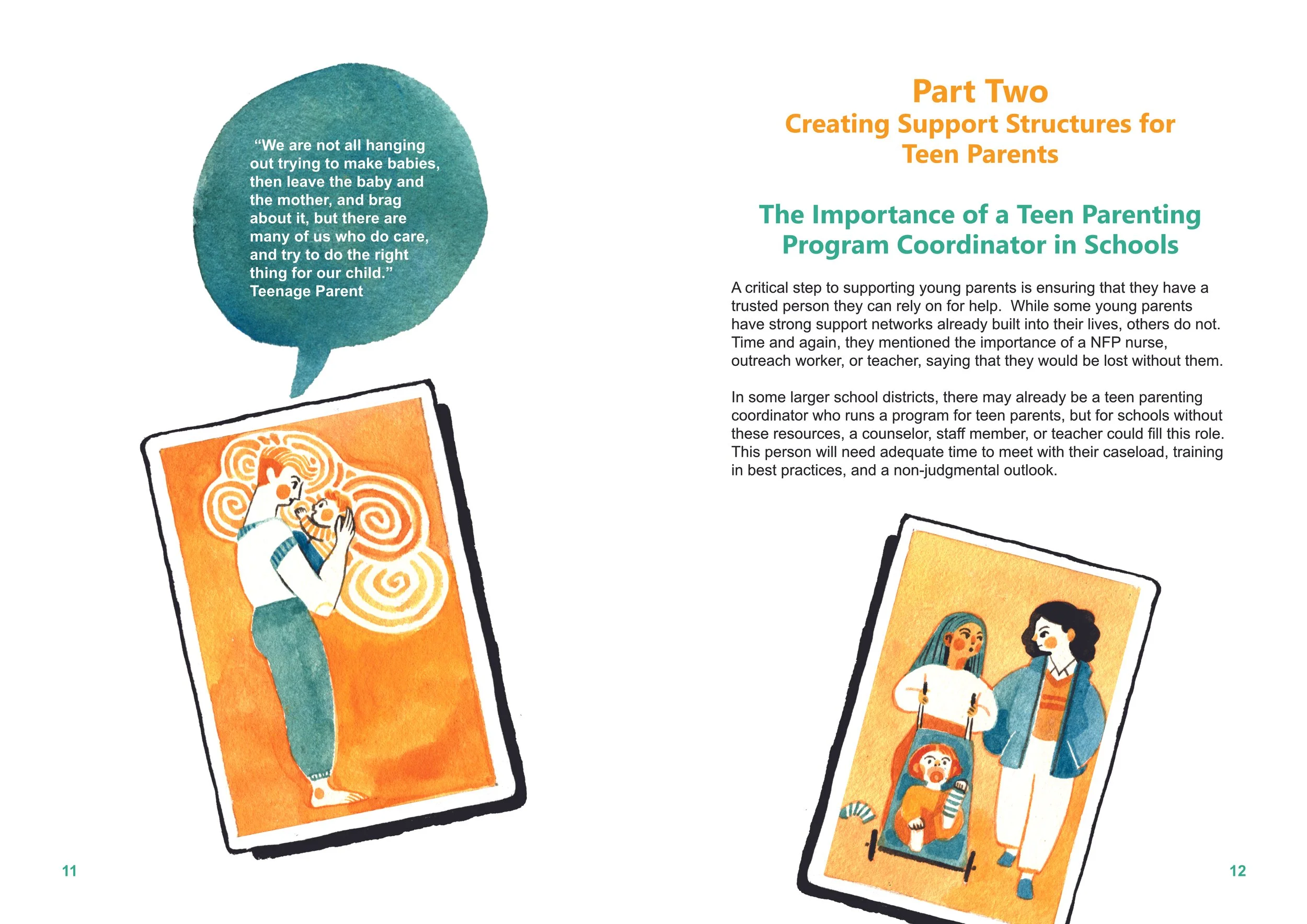
I like to imbue as much character and story into my work as possible. The research I have had the pleasure of working with often uses first person quotes. I want to give the images the life and personality that these interviews often convey.
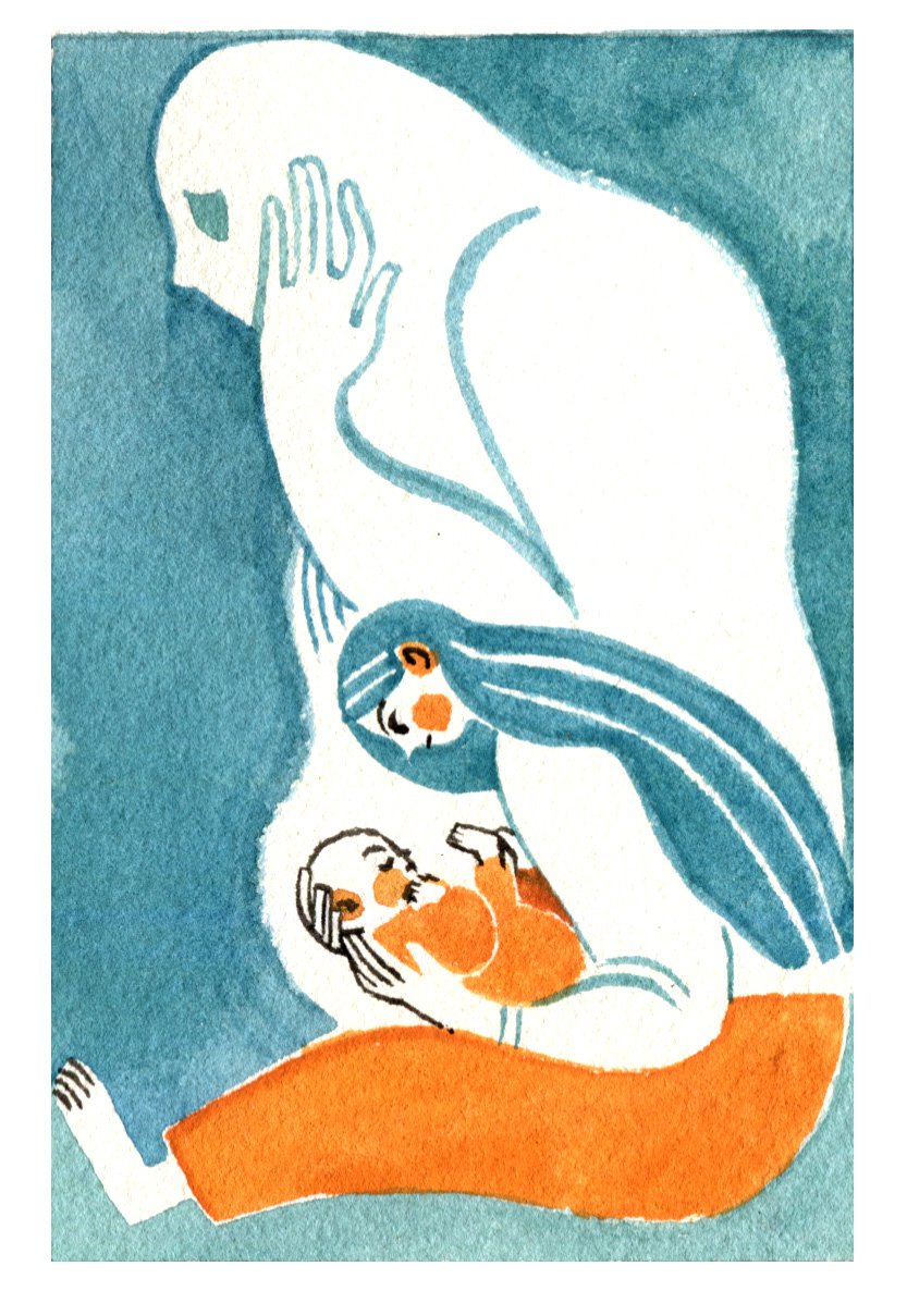
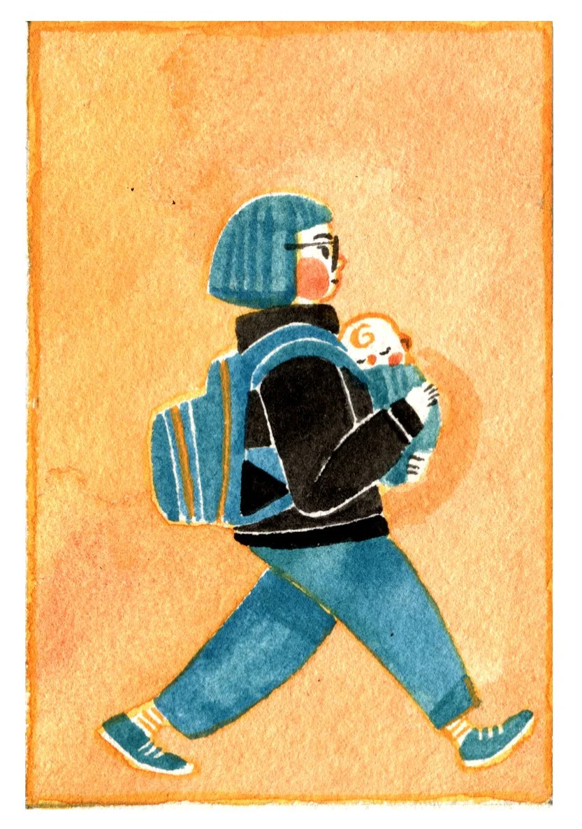
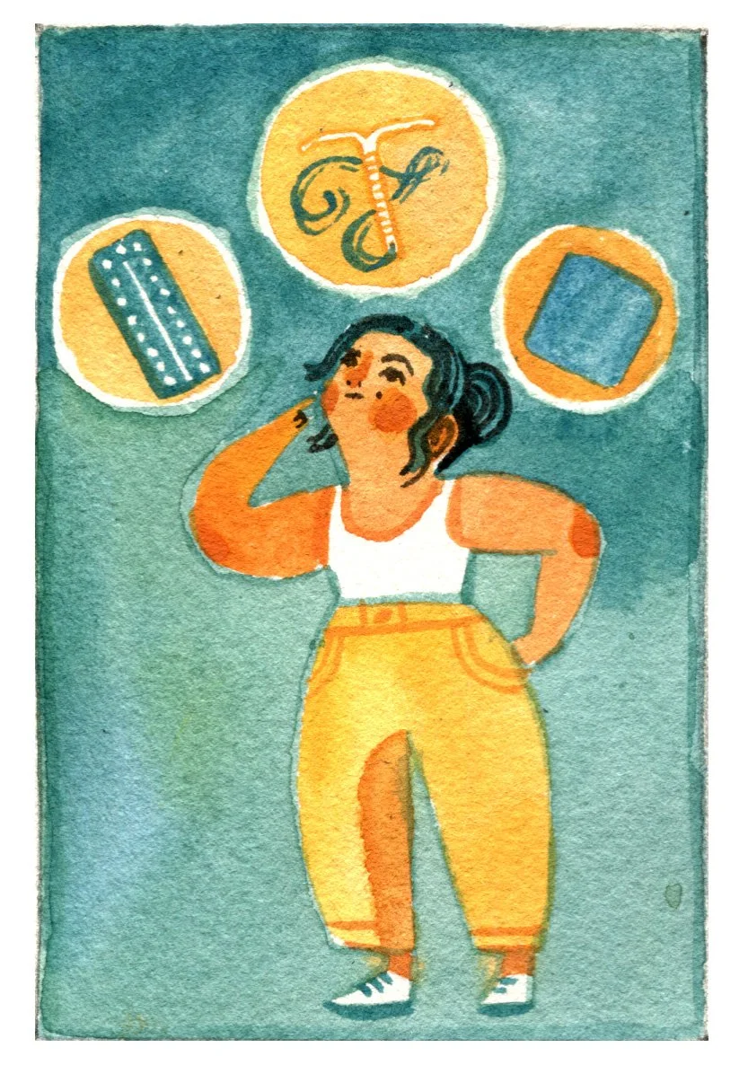
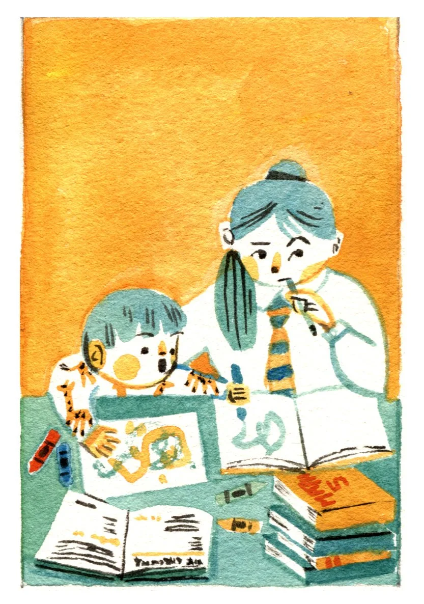
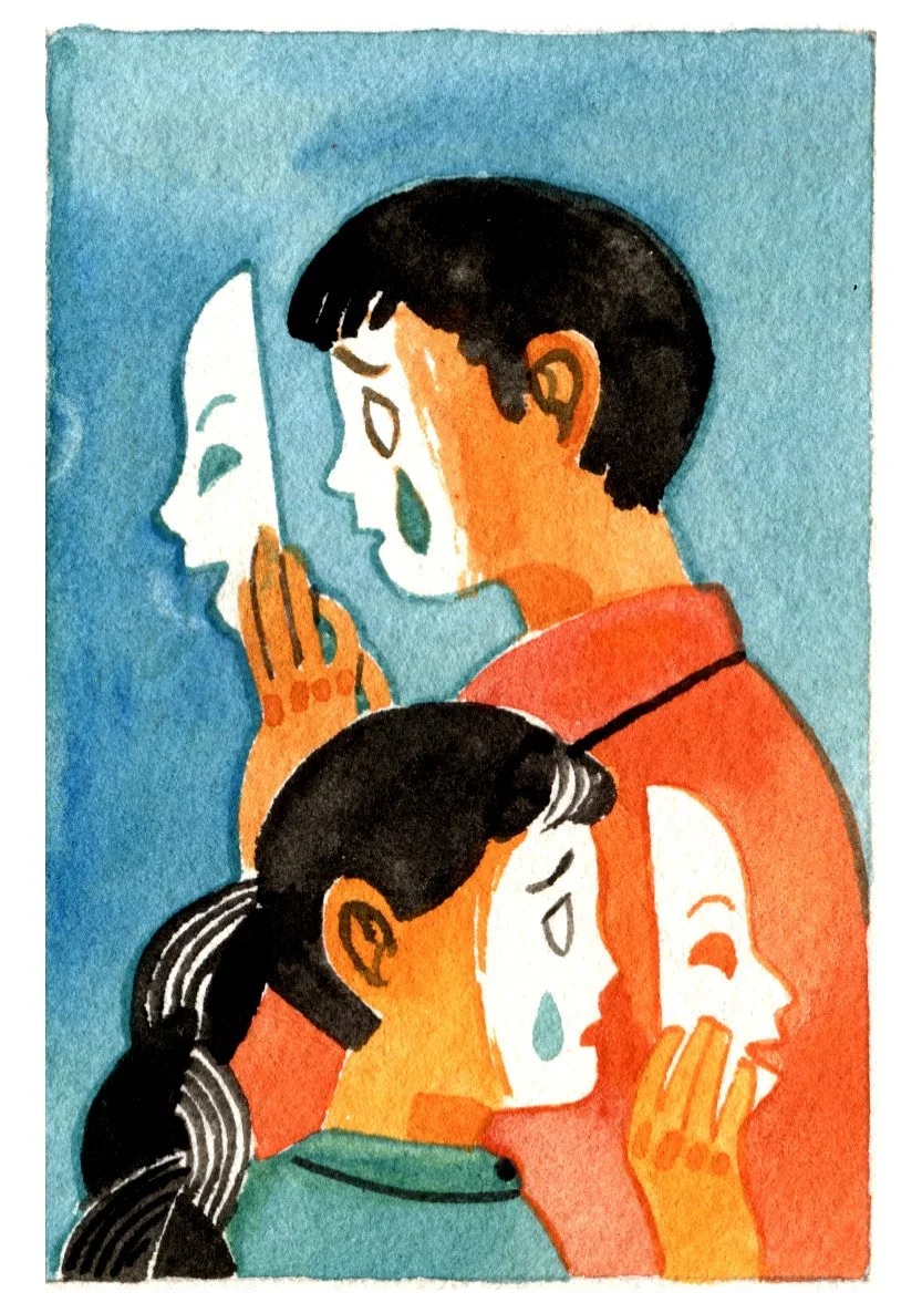
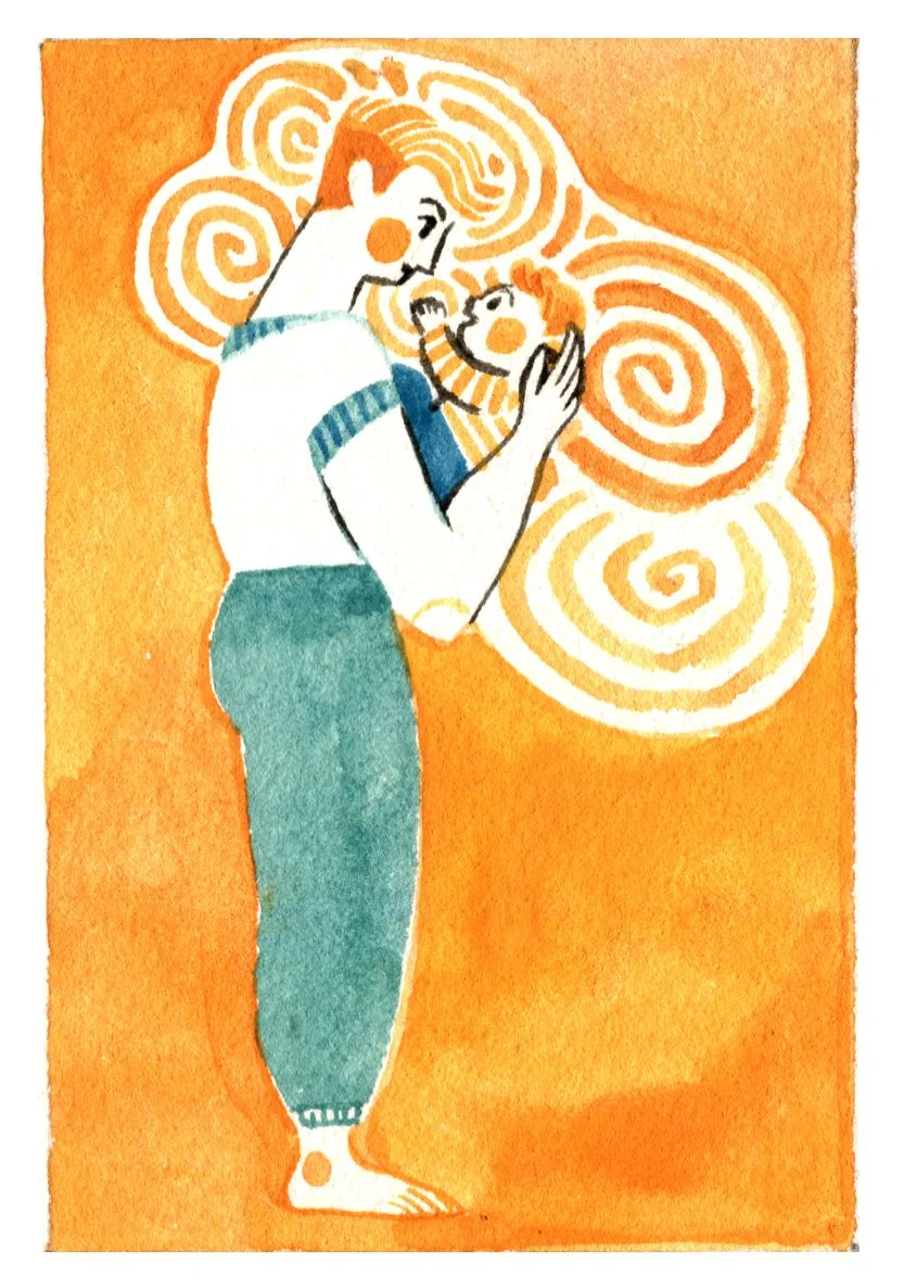
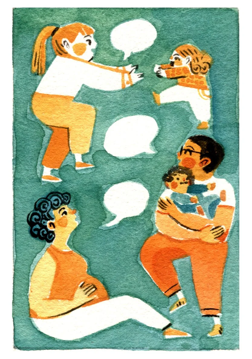
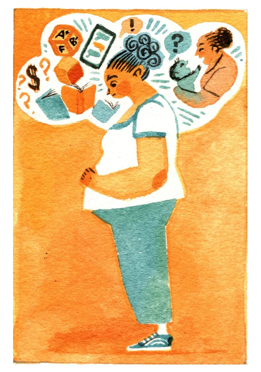
It wasn’t necessary for this particular project but I like to experiment with animation when I can. A versatile image can tell stories across multiple platforms and in many different forms. Thinking about the different ways an illustration might be used and how it might best be brought to life (be it with text, colours, composition or actual movement) helps me to design as dynamically as I can.
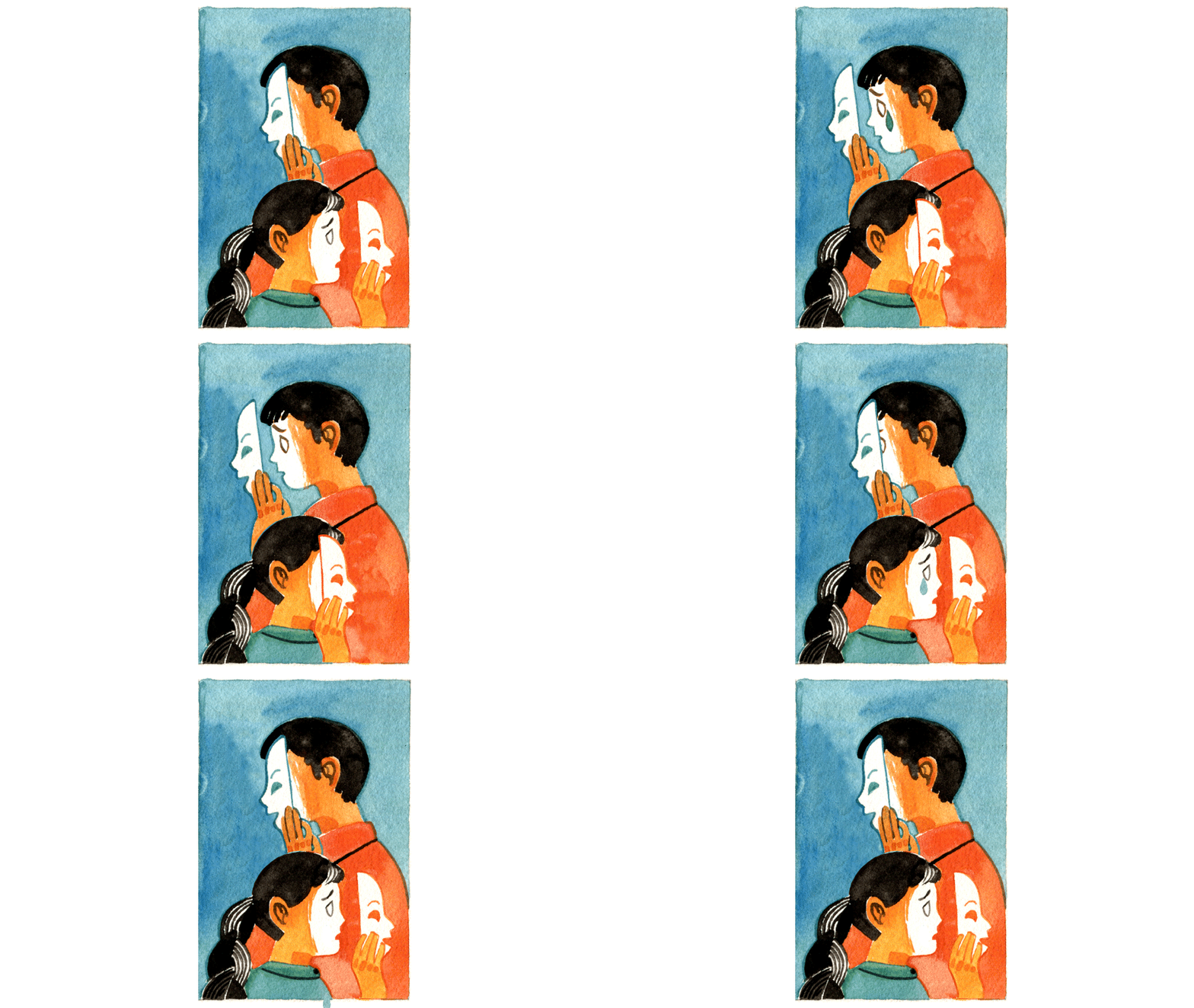
Masks animated. Hand drawn images, Photoshop and After Effects.
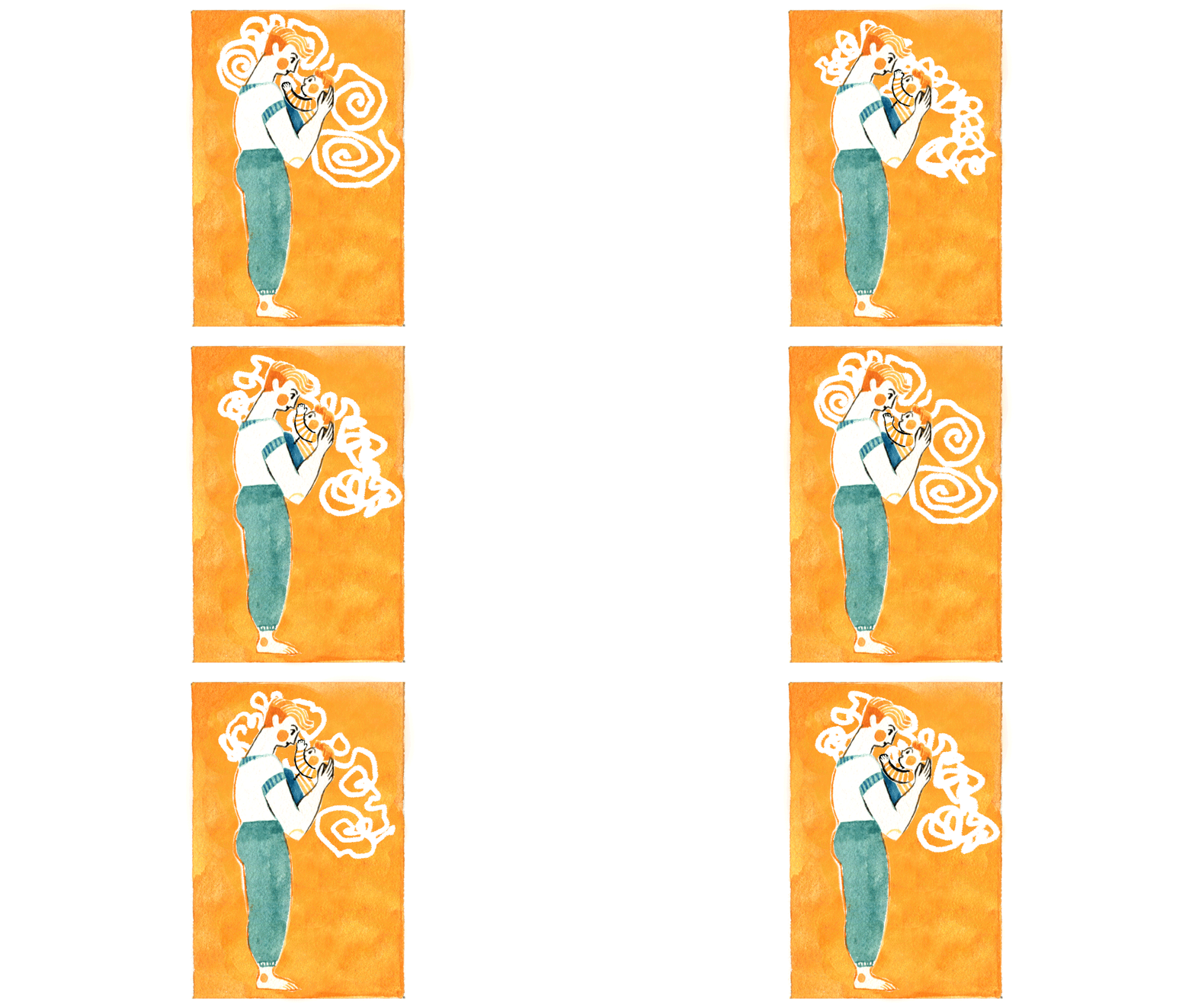
Little Dad animated. Hand drawn images, Photoshop and After Effects.