
Past Shelves
At the beginning of the year I was invited to the Lavender Menace Queer Book Archive to run a zine workshop. I was aware that the rich historied Menace had been reestablished, but was yet to visit.
It’s new lease of life was initiated by James Ley’s play ‘Love Song to Lavender Menace’ and it was a joy to see it thriving in St. Margaret’s House. So I don’t have to write it out, here are the notes I made on the archive while I was researching before the workshop:

About a month ago, the Menaces contacted me again asking if I would design a flier for their queer history project, Past Shelves, collecting oral histories of queer reading and bookshops in Scotland.

Ideally Lavender wanted an illustration that retained hand drawn qualities, watercolour or pencilled lines, and preferably layered for Riso.
The poster for LIFF is only the second thing I’ve designed for Riso and although it was ink drawn, the image is very flat. I still hadn’t quite gotten my head around making separations for print. I had no idea how to translate the undulating and rough hewn quality of paint and pencil into a print.
Of course, I panicked.

The project aims to shed light on the importance of queer literature and the book shop as a space of resistance and visibility that was so vital to LGBT+ communities.
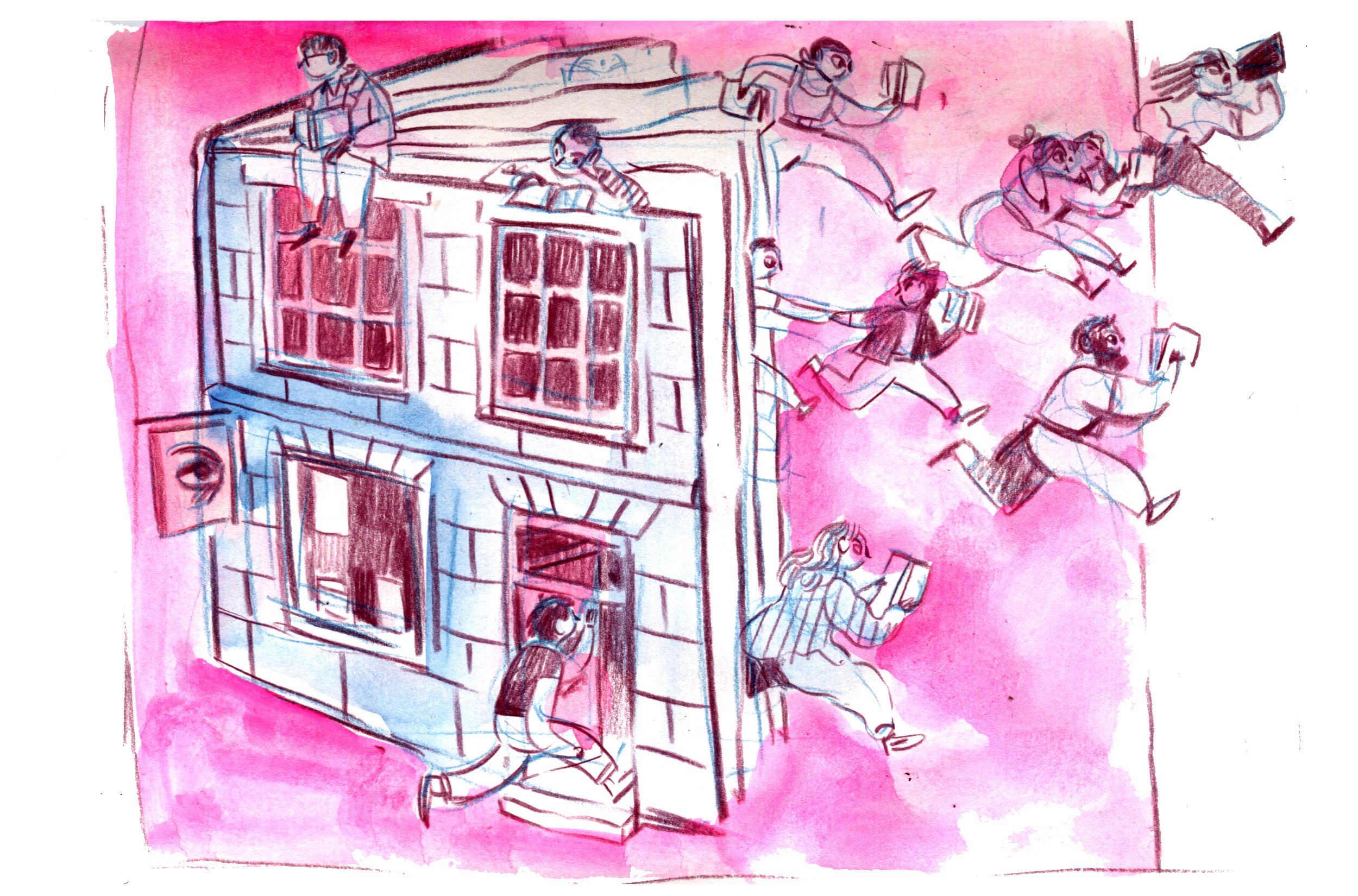
I sketched out some thumbnails, playing with texture and two basic colours. The image on the right was more in line with the brief, ‘books coming alive and off the shelves’, and was ultimately the one they chose. But I also pictured the bookshop as a place for transformation, community and power…an open book where queer folk can thrive.
I adorned their spines with queer books that had made a big impression on me.
Stone Butch Blues - Leslie Feinberg
Nevada - Imogen Binnie
Blue Horses - Mary Oliver
Zami: A New Spelling of My Name - Audre Lorde
City of Night - John Rechy
Just Above Your Head - James Baldwin
On Earth We’re Briefly Gorgeous - Ocean Vuong

After the sketch was approved, I went into the artistically frozen part of any commission I’m offered. A creative paralysis punctuated by flurries of hyperfocus and over production. It’s gotten better throughout the years as I’ve worked on more and more professional commissions.
But it’s always bad if there’s a new and unknown element in the mix. I made tracing after tracing, playing with shapes and colours and lines.


Here I begin to play with textures. Pencils and watercolours. Flat and subtle bases and bold details.
The colours also begin to emerge. Purple and orange or green and pink? In an ideal world I would I would be able to see how they mix and run through the printer itself but digital approximations will have to do.
Using hand drawn scans and the ‘spot colour’ feature on photoshop, I try and get approximations of how the ink will look but it’s impossible to get an accurate interpretation without using riso separating software (which currently only exists for Apples).

This is the final version, minus the book titles that were suggested: Zami, Orlando and Conundrum.
I like the image but the unknown of the printing is still a source of frustration. I have resolved to take a course with the inimitable Typewronger Books and finally learn Riso from the masters!
Watch this space…
And as always, let me know what you’ve been drawing!